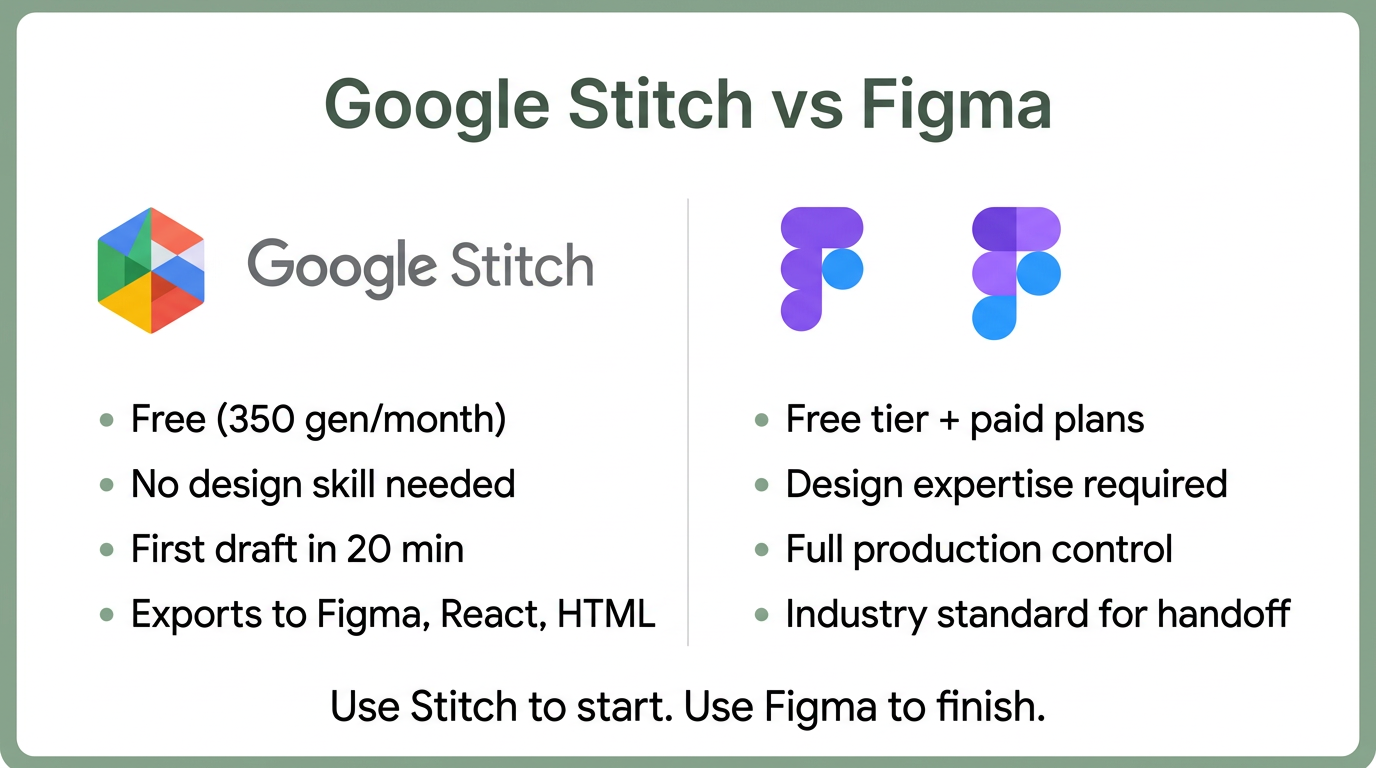
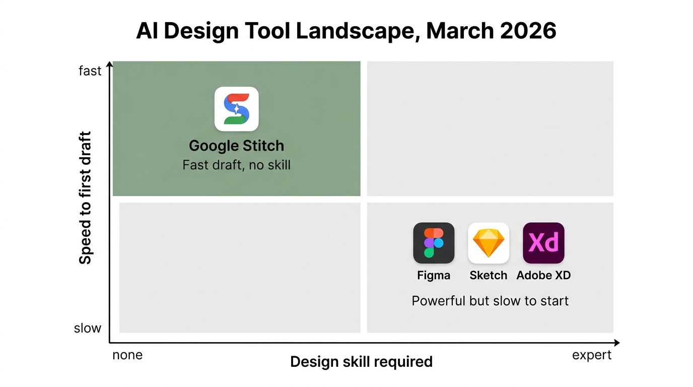
Quick verdict: Google Stitch is the better tool for generating a first draft fast. Figma is the better tool for finishing and polishing that draft. The March 19, 2026 Stitch update closed the gap on quality — not on precision. Use both.
| Google Stitch | Figma | |
|---|---|---|
| Best for | First drafts, rapid ideation, non-designers | Production design, collaboration, design systems |
| Pricing | Free (350 generations/month) | Free tier, $15-75/seat/month for teams |
| Skill required | None — describe what you want | Weeks to months of learning |
| Time to first draft | 20 minutes | Hours to days |
| Export formats | Figma, React + Tailwind, HTML/CSS, Flutter | Developer handoff, CSS, SVG |
| AI generation | Full UI from text, voice, or sketches | AI-assisted layout and content fill |
| MCP integration | Claude Code, Cursor, Gemini CLI | Via plugins |
AI Just Made the First 80% of Design Work Free
On March 19, 2026, Google shipped a major update to Stitch, its AI design tool. Figma shares dropped 8–10% in two days. The market priced in something most design teams haven’t internalized yet: the economics of early-stage design just changed.
Google Stitch gives you 350 free design generations per month. It exports to Figma format, React code, and HTML. All you need is a Gmail account. The tool sits at stitch.withgoogle.com and runs entirely in the browser.
The previous version of Stitch generated one screen at a time from a text prompt. The March update generates five simultaneously, remembers your entire project history, and lets you talk to your canvas with voice commands.
The 5 Features That Change Everything
The March 2026 update added five capabilities that shift Stitch from a novelty to a real workflow tool.
Infinite canvas. Images, text, code, and UI components live in one workspace. Drop a screenshot for visual reference, paste a code snippet, sketch a wireframe — Stitch reads all of it as context and generates UI that matches. This replaces the old single-prompt-per-screen model.
Design agent. The new agent reasons across your full project history, not just your last prompt. If you’ve built a login screen and a dashboard, the agent infers what comes next — settings page, profile view, onboarding flow — without you specifying it. The Agent Manager lets you branch and explore multiple design directions in parallel.
Voice canvas. Click the microphone and talk to your canvas. Say “give me three different navbar layouts” and it generates them. Say “convert this to dark mode with a warmer palette” and it redraws. The agent asks clarifying questions and offers critiques in real time. No design tool has offered anything like this before.
Instant prototypes. Static screens become clickable flows with one click. Hit Play and Stitch links your screens together, infers the user journey, and generates missing screens on the fly. What used to take hours of manual hotspot wiring now happens automatically.
MCP integration. Stitch ships an MCP server and SDK that connects directly to Claude Code, Cursor, and Gemini CLI. Designs flow into your codebase without switching tools or manually exporting. This is the feature that matters most for engineering teams.
The Workflow Revolution
The practical impact is speed. What used to take 3–4 days from brief to developer handoff now takes a morning.
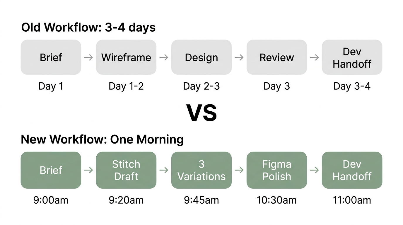
The brief comes in. You open Stitch. Twenty minutes later you have a designed, on-brand first draft. The client sees three variations. They pick one. You export to Figma, hand off to the developer. Same day.
That used to take a week. The time savings compound when you factor in revision cycles — Stitch makes it trivial to generate three variations instead of one, which means clients pick faster and design-by-committee conversations shorten.
The 4-Step Stitch Prompting Framework
Most people type one vague sentence into Stitch and get a generic design back. The tool works. The prompts are the problem.
This 4-step framework produces a production-ready first draft consistently. The difference between a 6/10 result and a 9/10 result is structure.
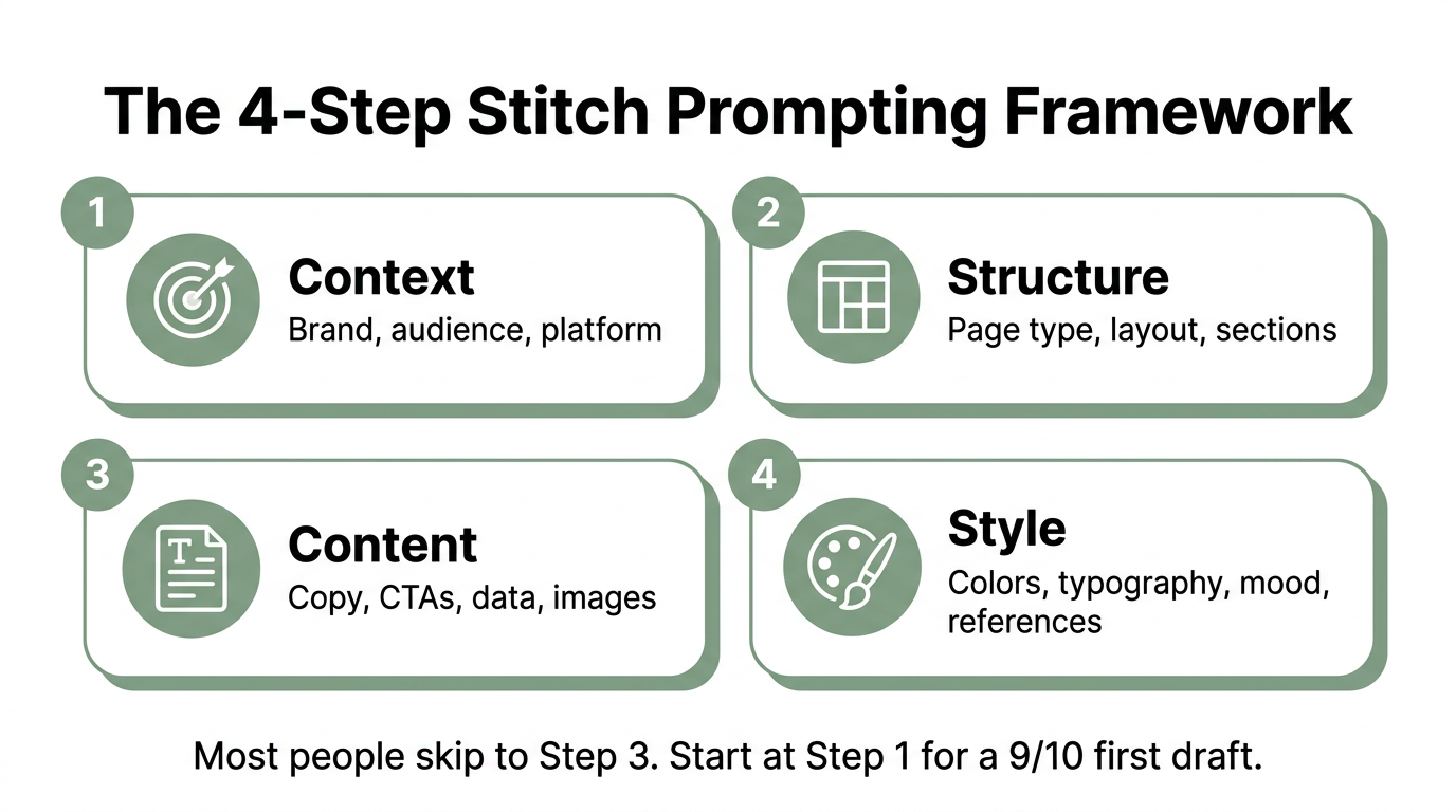
Step 1: Context
Tell Stitch who you are, who this is for, and where it will live. Without context, the AI defaults to generic SaaS templates.
Brand: [Company name], [industry]. Audience: [Who will use this]. Platform: [Web/mobile/tablet]. Existing brand: [Link to website or upload brand assets].
Step 2: Structure
Define the page type and layout before you describe content. This prevents the AI from guessing your information architecture.
Page type: [Landing page / dashboard / onboarding flow / pricing page]. Sections: [Hero, features grid, testimonials, CTA]. Layout: [Single column / sidebar / card grid]. Navigation: [Top nav with logo left, CTA right].
Step 3: Content
Now add the specifics. Copy, calls to action, data, placeholder images. The more specific you are here, the less editing you do later.
Headline: [Exact headline text]. Subhead: [Supporting text]. CTA: [Button text and destination]. Data: [Metrics, stats, or placeholder content]. Images: [Describe or upload reference images].
Step 4: Style
Set the visual direction last. Colors, typography, mood. If you have a DESIGN.md file or brand kit, reference it here.
Colors: [Primary, secondary, accent — hex codes if you have them]. Typography: [Sans-serif / serif / specific font]. Mood: [Minimal and clean / bold and energetic / corporate and trustworthy]. Reference: [Link to a site or upload a screenshot of the style you want].
The key insight: Most people jump straight to step 3 (content) or step 4 (style). Starting at step 1 gives Stitch the context it needs to make intelligent decisions about everything else. A well-structured prompt with all four steps produces a result you can ship with minor edits.
12 Copy-Paste Prompts
These are ready to paste into Stitch. Each follows the 4-step framework. Replace the bracketed text with your specifics.
Landing Pages
SaaS product page:
Context: B2B SaaS company selling [product]. Audience: [job title] at mid-market companies. Web, desktop-first.
Structure: Hero with headline and demo CTA, 3-column feature grid, social proof bar with logos, pricing toggle (monthly/annual), FAQ accordion, final CTA.
Content: Headline: "[Value proposition]". Subhead: "[Supporting benefit]". CTA: "Start Free Trial". Features: [Feature 1], [Feature 2], [Feature 3]. Logos: [Company 1], [Company 2], [Company 3].
Style: Clean, minimal. Primary: [hex]. Sans-serif typography. Generous whitespace. Reference: [competitor URL or screenshot].
E-commerce product page:
Context: D2C e-commerce brand selling [product category]. Audience: [demographic]. Mobile-first responsive.
Structure: Product image carousel left, details right. Size/color selectors. Add to cart CTA. Accordion for specs, shipping, reviews. Related products grid below.
Content: Product name: "[Name]". Price: $[XX]. Description: "[2-3 sentences]". Reviews: 4.8 stars, [XX] reviews. Shipping: "Free over $[XX]".
Style: Warm, premium. Lifestyle photography feel. Serif headings, sans-serif body. Muted earth tones. Reference: [brand URL].
Agency services page:
Context: [Type] agency. Audience: founders and marketing directors. Web.
Structure: Hero with bold headline and "Book a Call" CTA. Services grid (4 cards). Case study preview with metrics. Team section. Contact form.
Content: Headline: "[Agency positioning statement]". Services: [Service 1], [Service 2], [Service 3], [Service 4]. Case study: "[Client] saw [X]% increase in [metric]".
Style: Bold, confident. Dark background with accent color. Large typography. Geometric accents. Reference: [inspiration URL].
Dashboards
Analytics dashboard:
Context: Internal analytics tool for [team/department]. Web app, desktop.
Structure: Top bar with date range picker and filters. KPI cards row (4 metrics). Line chart (primary metric over time). Data table with sorting. Sidebar navigation.
Content: KPIs: [Metric 1], [Metric 2], [Metric 3], [Metric 4]. Chart: [Primary metric] over last 30 days. Table columns: [Col 1], [Col 2], [Col 3], [Col 4].
Style: Clean, data-focused. Light theme. Blue primary. Monospace numbers. Subtle grid lines. Reference: [Stripe Dashboard or similar].
Admin panel:
Context: Admin panel for [SaaS product]. Audience: internal ops team. Web.
Structure: Left sidebar nav (Dashboard, Users, Settings, Billing). Header with search and user avatar. Main content area with tabbed interface. Action buttons top-right.
Content: Nav items: Dashboard, Users, Content, Analytics, Settings. User table: Name, Email, Role, Status, Last Active. Actions: Edit, Suspend, Delete.
Style: Neutral, professional. Gray sidebar, white content area. Minimal color — status badges only. Small, dense typography. Reference: [Notion admin or Linear].
User-facing dashboard:
Context: Customer-facing dashboard for [product]. Audience: end users. Responsive.
Structure: Welcome header with user name. Progress card or status widget. Activity feed. Quick actions grid (4 buttons). Settings link.
Content: Welcome: "Good morning, [Name]". Progress: "[X]% complete". Activity: Last 5 actions. Quick actions: [Action 1], [Action 2], [Action 3], [Action 4].
Style: Friendly, approachable. Rounded corners. Soft shadows. Pastel accent colors. Illustrations or icons for empty states.
Mobile Apps
Onboarding flow:
Context: Mobile app for [product]. iOS and Android. New user first experience.
Structure: 3-4 swipeable screens. Each: illustration top, headline center, description below, progress dots, skip/next buttons.
Content: Screen 1: "[Core value prop]". Screen 2: "[Key feature]". Screen 3: "[Social proof or trust]". Screen 4: Sign-up form (email, password, CTA).
Style: [Brand colors]. Large illustrations. Centered layout. Generous padding. Smooth transitions between screens.
Settings screen:
Context: Mobile app settings for [product]. iOS-style navigation.
Structure: Grouped list sections. Profile card at top (avatar, name, email). Sections: Account, Notifications, Privacy, Support, Legal. Toggle switches for boolean settings.
Content: Account: Edit Profile, Change Password, Connected Accounts. Notifications: Push, Email, SMS (toggles). Privacy: Data Export, Delete Account. Support: Help Center, Contact Us.
Style: Native iOS feel. System font. Grouped inset list style. Subtle separators. Blue accent for interactive elements.
Social feed:
Context: Social/community feature in [app]. Mobile-first.
Structure: Tab bar bottom (Home, Search, Create, Notifications, Profile). Feed of cards. Each card: avatar, username, timestamp, content, engagement bar (like, comment, share). Pull-to-refresh. Floating action button for new post.
Content: 3 sample posts with different content types (text, image, link). Engagement counts. Timestamp format: "2h ago".
Style: Clean, content-focused. White cards on light gray background. Rounded avatars. Subtle shadows. Accent color for interactive elements.
Other Use Cases
Pitch deck slide:
Context: Investor pitch deck for [company]. Presentation format, 16:9.
Structure: Title slide with company name, tagline, and logo. Problem slide with 3 pain points. Solution slide with product screenshot. Traction slide with 4 metrics.
Content: Company: "[Name]". Tagline: "[One line]". Problem: [Pain 1], [Pain 2], [Pain 3]. Metrics: [Revenue], [Users], [Growth rate], [Retention].
Style: Bold, high-contrast. Dark background. Large numbers. Minimal text. One idea per slide. Reference: [YC demo day style].
SaaS pricing page:
Context: Pricing page for [SaaS product]. Web, responsive.
Structure: 3-tier pricing cards (Free, Pro, Enterprise) side by side. Feature comparison table below. FAQ accordion. Toggle for monthly/annual.
Content: Free: $0, [3 features]. Pro: $[XX]/mo, [6 features], "Most Popular" badge. Enterprise: "Contact us", [all features + custom]. Annual discount: [X]%.
Style: Clean, conversion-focused. Primary color on Pro tier CTA. Checkmarks for included features. Subtle background on recommended plan.
E-commerce collection page:
Context: Product collection/category page for [brand]. Responsive.
Structure: Hero banner with collection name and description. Filter sidebar (price, size, color, sort). Product grid (3-4 columns). Each card: image, name, price, rating. Pagination or infinite scroll.
Content: Collection: "[Collection name]". [XX] products. Filters: Price range, [Category-specific filters]. Products: Name, $[XX], [X] stars.
Style: [Brand aesthetic]. Clean grid. Hover effects on product cards. Sticky filter bar on mobile. Reference: [brand URL].
5 Hidden Stitch Features
These are in the March 2026 update but aren’t covered in the launch posts or most tutorials.
1. Voice Canvas
Click the microphone icon in Stitch and start talking. The design agent becomes a voice-activated collaborator powered by Gemini Live. You can describe changes (“make the header bolder, move the CTA above the fold”), ask for critiques (“what’s weak about this layout?”), or have it interview you to generate a page from scratch.
When to use it: Minor adjustments and rapid iteration. “Convert this to dark mode” or “give me a version with a sidebar instead of a top nav” are exactly the kinds of quick tweaks where voice is faster than typing.
2. Instant Prototypes
Hit the Play button on any set of screens. Stitch links them into a clickable prototype automatically — no hotspot wiring, no manual transitions. If you click a button and there’s no destination screen, Stitch generates one based on context.
When to use it: After every significant design change. Testing flows continuously catches structural problems early. The AI-generated missing screens also reveal gaps in your information architecture.
3. DESIGN.md Brand Kit Import
Every Stitch project initializes with a default design system captured in a Markdown file called DESIGN.md. You can replace it with your own — colors, typography scales, spacing rules, component styles — and every screen Stitch generates will conform to your brand.
The most powerful trick: point Stitch at any live website URL, and it extracts a DESIGN.md from the existing design. Import that file into your project, and every generation matches the source site’s visual language.
When to use it: At the start of every project. Create your DESIGN.md once, reuse it across every Stitch project. This is how you go from “AI-generated mockup” to “brand-consistent first draft.”
4. Agent Manager
The Agent Manager tracks multiple parallel design explorations — think of them as branches. You can have the agent working on three different visual directions simultaneously, compare them side by side, and merge the best elements.
When to use it: Client presentations. Generate three distinct directions in 20 minutes instead of spending a week on one. Clients pick faster when they can compare concrete options.
5. MCP Server and SDK
Stitch exposes an MCP (Model Context Protocol) server that lets coding assistants invoke Stitch programmatically. Claude Code, Cursor, and Gemini CLI can all call the Stitch MCP server to generate UI screens mid-development.
When to use it: When your design-to-code pipeline needs to be seamless. A developer working in Cursor can generate a UI component through Stitch without leaving their IDE, get the React + Tailwind output, and integrate it directly.
Stitch vs Figma: The Real Breakdown
When Stitch Wins
- Speed to first draft. Twenty minutes from a blank page to a designed, multi-screen prototype. Figma can’t compete here for non-designers.
- Ideation volume. Generate ten directions in the time it takes to build one in Figma. Exploring more options faster means finding the good idea sooner.
- Non-designer accessibility. Founders, product managers, and developers can produce credible designs without design training. This unblocks teams that don’t have a dedicated designer.
- Cost. 350 free generations per month vs Figma’s $15-75/seat/month for team features.
- Voice iteration. No other design tool lets you have a conversation with your canvas.
When Figma Still Wins
- Production design systems. Figma’s component libraries, auto layout, variables, and design tokens are mature. Stitch has DESIGN.md, which is promising but not at the same depth.
- Collaboration. Figma’s multiplayer editing, comments, and developer handoff workflows are industry standard. Stitch is currently single-user.
- Pixel-perfect control. When you need exact spacing, alignment, and responsive behavior, Figma gives you manual control that Stitch’s AI can’t match.
- Developer handoff. Figma’s inspect mode, code generation, and Dev Mode are what engineering teams know. Stitch exports clean code, but the handoff workflow is less established.
- Design maturity. Stitch generates a strong first draft. Figma is where you refine, polish, and build something production-ready.
The Hybrid Workflow
The winning approach uses both. Start in Stitch for speed. Finish in Figma for precision.
- Brief arrives — open Stitch, use the 4-step prompting framework
- Generate 3 variations — use Agent Manager to explore parallel directions
- Client picks a direction — show all three, get alignment in one session
- Export to Figma — Stitch preserves layers and components on export
- Polish in Figma — refine spacing, build out the design system, add responsive behavior
- Hand off to development — use Figma’s Dev Mode or export Stitch’s React code directly
For teams already using no-code AI tools, Stitch slots into the workflow as the design step that was previously outsourced or skipped entirely. For teams evaluating whether to build custom or use off-the-shelf tools, Stitch dramatically lowers the cost of prototyping before you commit to a development path.
The MCP Integration Guide
Stitch’s MCP server lets you connect design generation directly to your code pipeline. Here’s how to set it up with Claude Code and Cursor.
Connecting Stitch to Claude Code
- Install the Stitch MCP server: the SDK is available at Google’s Stitch developer docs
- Add the MCP server configuration to your Claude Code project settings
- Authenticate with your Google account (the same Gmail that has Stitch access)
- Use the
generate_uitool to create screens from within Claude Code
Once connected, you can describe a UI component in your Claude Code session and get a Stitch-generated design plus React + Tailwind code back — without leaving your terminal.
Connecting Stitch to Cursor
- Open Cursor Settings > Features > MCP
- Add a new MCP server pointing to the Stitch SDK endpoint
- Authenticate with your Google account
- Stitch tools become available in Cursor’s agent mode
The practical value: a developer working on a feature in Cursor can say “generate a settings page that matches our existing dashboard style” and get both the visual design and the implementation code in one step.
The Design-to-Code Pipeline
The full pipeline looks like this:
- Stitch generates the UI design (via MCP or directly in the browser)
- Export as React + Tailwind or HTML/CSS
- The coding assistant refines the generated code to match your component library
- DESIGN.md ensures visual consistency across generated screens
This collapses what used to be a multi-day handoff process into a single automated pipeline. For teams building with AI development frameworks, the MCP integration means design is no longer a bottleneck.
3 Workflows Worth Stealing
Pitch Deck in 25 Minutes
Use the pitch deck prompt from above. Generate all slides in one session using the Agent Manager to explore two visual directions simultaneously. Export to Figma for final polish. Total time: 25 minutes from blank page to presentation-ready deck.
This replaces the $2,000–5,000 freelance design cost for early-stage founders who need to move fast. The quality won’t match a senior designer’s work, but for a seed-stage pitch or internal presentation, it’s more than sufficient.
Landing Page Same Day as the Brief
Brief arrives at 9:00 AM. Open Stitch by 9:05. Run the SaaS landing page prompt with your brand’s DESIGN.md loaded. By 9:25, you have a designed first draft. Generate two more variations by 9:45. Share all three with the client. They pick by 10:00. Export to Figma, polish for 30 minutes. Hand off to development by 11:00. Page goes live same day.
This workflow works especially well for agencies and marketing teams running high-volume landing page programs where speed matters more than bespoke design.
The Variation Pressure Test
When a client can’t decide on a direction, use Stitch to generate five variations in 15 minutes. Present all five. The conversation shifts from “I’m not sure what I want” to “I like elements of version 2 and version 4.” Merge those elements in Figma. Client alignment in one session instead of three revision rounds.
This works because the cost of generating a variation in Stitch is nearly zero. In Figma, every new direction costs hours. When exploring is cheap, you explore more, and you converge faster.
Frequently Asked Questions
Is Google Stitch really free?
Yes. Stitch offers 350 free design generations per month at stitch.withgoogle.com. All you need is a Google account. There are no paid tiers as of March 2026. The tool runs entirely in the browser — no software to install.
Can Stitch replace Figma?
Not for production design work. Stitch generates strong first drafts but lacks Figma’s depth in design systems, multiplayer collaboration, responsive design controls, and developer handoff workflows. The expert consensus is that Stitch handles the first 80% (ideation and drafting) while Figma handles the last 20% (polish and production). Most teams will use both.
How does Stitch export to Figma?
Stitch exports designs as editable Figma files with preserved layers and components. Click the export button, select Figma format, and open the file in Figma. The export maintains the structure so you can immediately start refining — adjusting spacing, swapping components, building out responsive variants.
Do I need design experience to use Stitch?
No. Stitch generates complete UI designs from text descriptions, voice input, or uploaded sketches. The 4-step prompting framework in this article is specifically designed to help non-designers produce professional-quality first drafts. Design experience helps you refine the output, but it’s not required to get started.
How does the MCP integration work with Claude Code?
Stitch ships an MCP server that coding assistants can call programmatically. When connected to Claude Code or Cursor, developers can request UI generation from within their development environment. The response includes both the visual design and exportable code (React + Tailwind, HTML/CSS, or Flutter). This eliminates the traditional design-to-development handoff for prototyping workflows.
What is DESIGN.md?
DESIGN.md is a Markdown file that captures your design system — colors, typography, spacing, component styles. Every Stitch project has one by default. You can customize it with your brand guidelines, or have Stitch extract one from any existing website URL. When DESIGN.md is set, every screen Stitch generates follows your brand consistently. Think of it as a brand kit that the AI actually reads and follows.
Key Takeaways
- Google Stitch’s March 2026 update adds infinite canvas, design agent, voice canvas, instant prototypes, and MCP integration — turning it from a single-screen generator into a full design workflow tool
- Stitch is free with 350 generations per month. Figma starts at $15/seat/month for team features
- Use the 4-step prompting framework (Context, Structure, Content, Style) to go from a 6/10 generic result to a 9/10 production-ready first draft
- The hybrid workflow wins: Start in Stitch for speed, export to Figma for polish, hand off to development same day
- MCP integration connects Stitch directly to Claude Code and Cursor, collapsing the design-to-code pipeline into a single step
- DESIGN.md is the key to consistency — create it once, reuse across every project so every AI-generated screen matches your brand
- For AI prototyping tools, Stitch is now the fastest path from idea to designed prototype
SFAI Labs